


Ricky Tollman’s Run This Town is a fictionalized account of Toronto mayor Rob Ford’s final year in office. In the film, journalist Bram Shriver (Ben Platt) tries to get his hands on a video of Ford (Damian Lewis) smoking crack to break the story for his struggling newspaper. The film premiered at last year’s South By Southwest film festival and recently received three Canadian Screen Award nominations.
Production designer Chris Crane received one of those CSA nominations for his work on Run This Town. On the surface, the film doesn’t appear to be the kind of period drama that typically receives awards attention. But look closer. For the film, Crane brilliantly recreates the political world of the Toronto mayor’s office as well as the crumbling world of print journalism. In all great production design, the tiniest details help sell the story and envelope the viewer in the world of the film. Crane’s work on Run This Town does exactly that.
Here, Chris Crane talks to Awards Daily about his cinematic inspirations for the film. He also shares his strategy for using color in key ways within the film, avoiding bland palates in favor of unexpectedly vibrant colors. Finally, he shares the biggest challenges in building the world of Run This Town.
Awards Daily: Congratulations on the Canadian Screen Award nomination for Run This Town! It’s nice to see production design that’s not necessarily a costume drama receive attention.
Chris Crane: Yes, variety is always good, I think.
AD: Absolutely. So, when Ricky Tollman approached you with the script for Run This Town, what were your initial thoughts about working on the project?
CC: For me, I really liked the script, but I don’t know that I fully understood the aesthetic yet. I took it as a more serious drama, and while it’s obviously not a comedy, it does have these dark comedic elements to it. I went in with a package showing different office references I found and a vision of what city hall would look like and other things. Ricky wanted to have a little more fun with the newspaper since it’s totally fictionalized. He saw it as a little more run down and dated than I expected it to be. It caused us to have more fun with the overall aesthetic. I already liked the material, but it became more exciting as we shifted focus from making it hyper-realistic to making it just look really good.
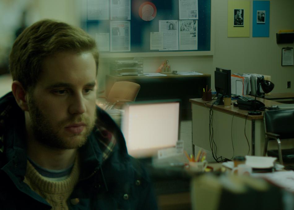
AD: The newspaper office featured in Run This Town is an office on the decline. How do you reflect that in the design?
CC: First, we went through as many options as we could find. I didn’t want to make it look super period. I didn’t want people to see it and think it was totally from the past. So we leaned into a lot of oranges. There’s some older technology in the corners of the spaces, but there’s still computers everywhere, phones, and everyone’s using texts. The office has been declining since the late 80s, early 90s, so there’s stuff left over – awards from back in the day or articles framed on the walls. We’re leaving these breadcrumbs as to it not really getting that overhaul that it should have had.
AD: Backing up a bit, when you started getting engaged in the project and thinking about what the spaces would look like, what were some of your cinematic inspirations? Did you call back to any films?
CC: Ricky had some films that he and the DP, Nick Haight, were influenced by, especially in the tone of the script like All the President’s Men or Absence of Malice.
AD: It reminded me a lot of Zodiac too.
CC: Yes, that was a big one. We looked at those films as a way to update the aesthetic but still have a nod to something retro. It was fun to try and fight that as well. We did the door in some of the side rooms in bright oranges, so I wanted to keep the bullpen a little more neutral. When he walked in, Ricky was like, “Where’s all the orange?” So I ran out and grabbed a few things to fill the space. It was fun for him to want more. I’m so used to doing films where the director wants it hyper realistic, very lived in. That’s fun to do, but it’s also fun to play a little more and have fun with colors, graphics, and stuff like that.
AD: So, how do you think color is used in your design?
CC: For me, because the movie mostly takes place in different office environments, I was really afraid of having the offices look really similar. So, we obviously knew what Toronto city hall looked like. Luckily, there was a lot of blues and purples, kind of mid-century aspects to the space. We then came up with the orange as the accent-ish color for The Record with a lot of creams and black to offset it. Then, we had some fun with the police station. It was a mid-century closed police station in Toronto that you can shoot in. It had a weird accent wall of turquoise tile left over from a city pool. A lot of shows filming there covered it up, but we leaned into it and brought some stark turquoises and plums for that space. Ultimately, I didn’t want people to think we just rolled the scene dressing from one scene to the next, so we honestly tried to reinvent each space and make them unique. For me, an easy way to do that is through color.
AD: The interior scenes weren’t obviously filmed, for example, in the actual mayor’s office. Tell me about finding spaces in which you could create these sets.
CC: We thought the newspaper office would be the hardest to find. We ended up finding a very old, closed down media office which hosted smaller newspapers in the 1990s that was empty. It was kind of perfect in a way, even though it was a newspaper office, it didn’t function as we needed it to. That was mostly painting and set decoration and cleaning up. Some of the ceiling had caved in.
But then we found out that, no, city hall was going to be the hardest to find. There was a space that we looked at for the newspaper office that didn’t work. It was an old Lever Brothers soap factory in Toronto. The carpet was destroyed. The walls had been used as practice for golf. But it had some of the look for city hall and the right space. That was the biggest build and transformation.
AD: You’ve talked about some of the challenges already, but what was the thing that kept you up the most at night?
CC: I think it was probably getting city hall right. We shot the city hall and council chamber at city hall at night, so we could kind of roam around and take photos to make sure we’d copied things appropriately for our fake city hall. My worry was that it wouldn’t look enough like the real thing. The real mayor’s office is actually on the second level. There were a lot of details that I wished we could have brought in, but because of space and time, we couldn’t do it. That was the most stressful, but I think we did pull it off.
Run This Town is now playing in theaters.


![2025 Oscars: Can a Late-Breaker Still Win Best Picture? [POLL]](https://www.awardsdaily.com/wp-content/uploads/2024/10/gladiator-350x250.jpg)
